indent was approached to aid a start-up in the cryptocurrency investment space to help define & establish their brand in the market.
— Naming
— Brand Positioning
— Logo Design
— Brand Positioning
— Logo Design
Challenge:
The cryptocurrency market is a new & extremely volatile one, and brands looking to provide investment opportunities & financial management services ultimately need to display trust through their communication channels & product offerings.
Approach:
The initial phase involves research into the market & competitor analysis to define the brand positioning. This exercise will uncover a relevant & available name that is aligned to the brand mission & vision.
A bespoke visual identity system will be created to showcase the entity in an attractive & memorable style, tailored to the target audience.
Solution:
The name generation & brand positioning phase successfully yielded the name AQRU.
Purposely spelled in a unique way creates an interesting & modern brand personality.
The word accrue means:
1. to happen or result as a natural growth, addition, etc.
2. to be added as a matter of periodic gain or advantage, as interest on money
2. to be added as a matter of periodic gain or advantage, as interest on money
And when combined with the domain name, AQRU.net, a clever play on the financial terminology of net wealth growth / accruement was achieved.
The logo design phase then focused on the brand values:
— Professional
— Secure
— Transparent
— Accessible & Approachable
— Professional
— Secure
— Transparent
— Accessible & Approachable
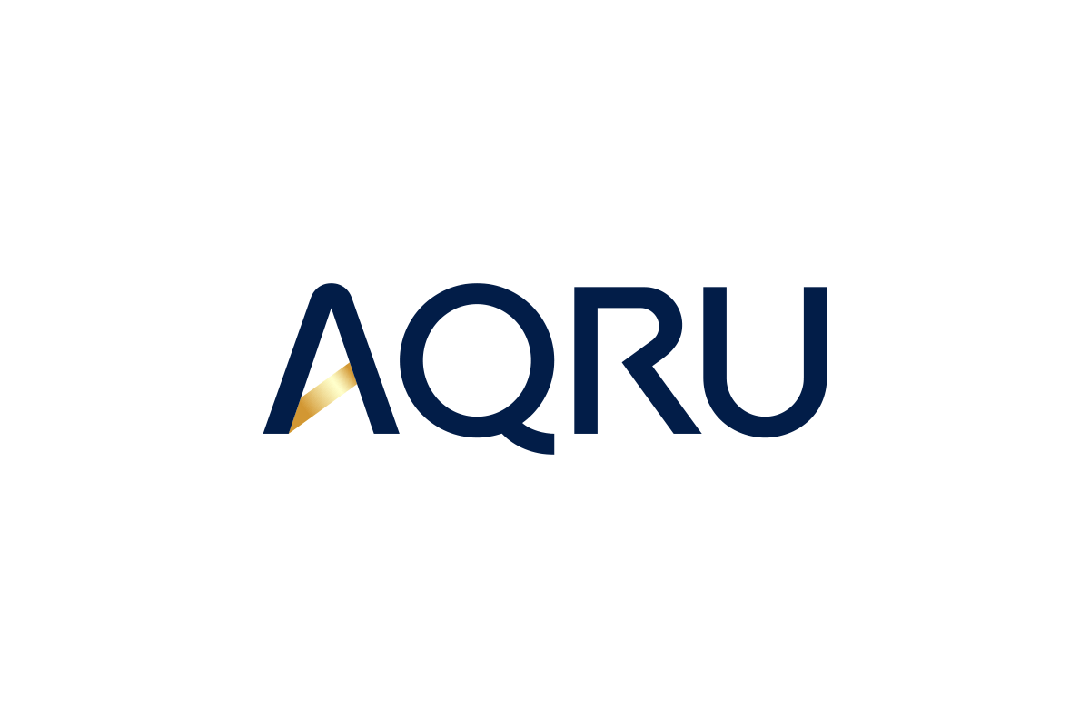
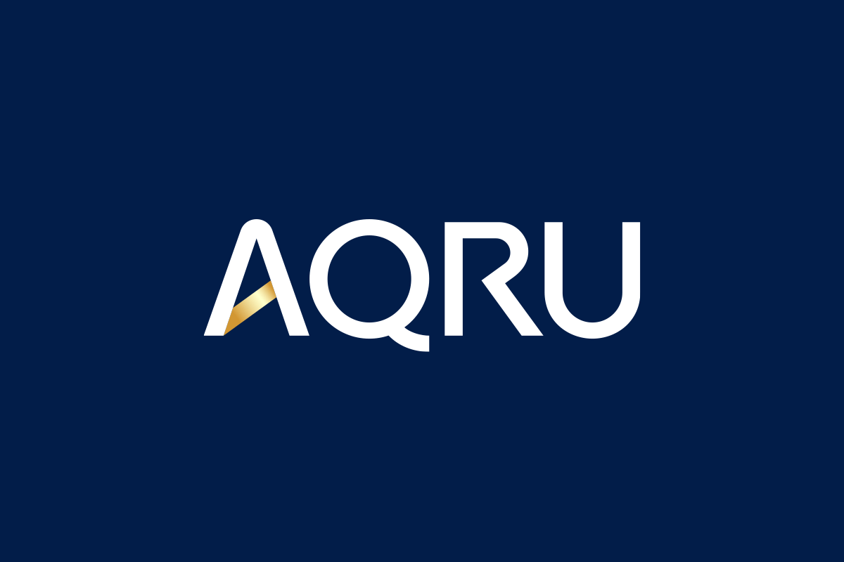
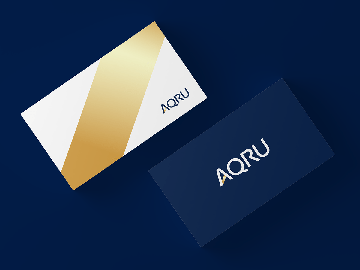
The custom made logotype represents simplicity in its uncomplicated & unobstructed, geometric, upper-case form ultimately increasing readability & recognition at all sizes.
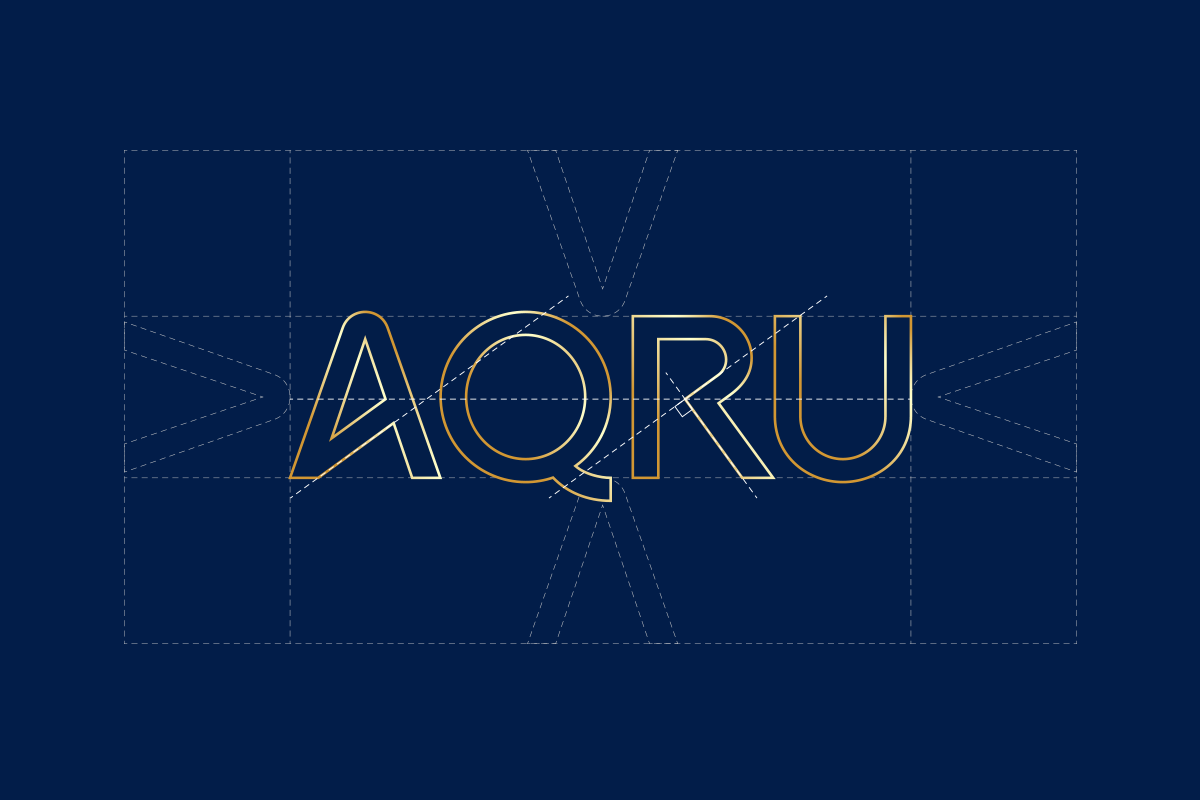
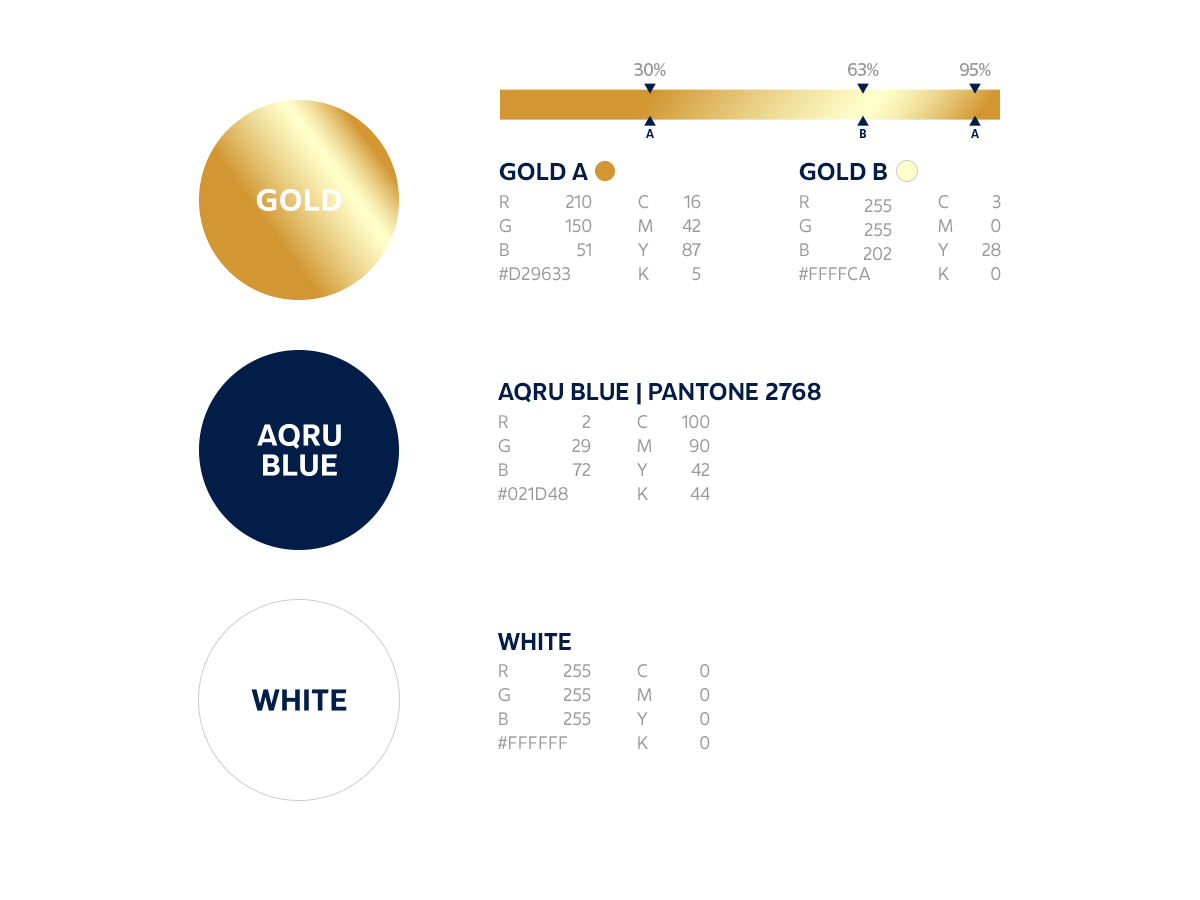
The crossbar of the A was transformed into AQRU's key brand defining element, the progressive gold bar.
Gold being indicative of wealth & finance is angled to symbolise growth & progression.

The AQRU colour palette was kept minimal, creating a bold impact through the contrast of navy-blue & white. This allowed the gold to be a focal point in a classy & professional manner.